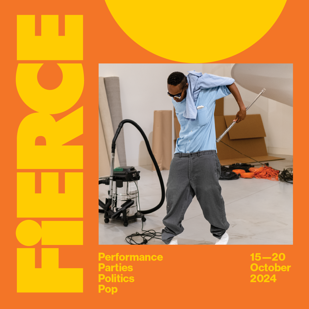
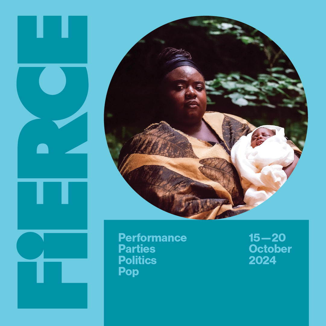
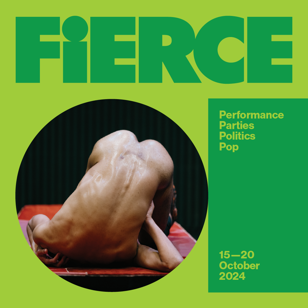
We’re beyond excited to share that over the last couple of months – in preparation for this year’s festival – the Fierce brand has had a bit of a glow up! With the help of Monnet Design, our 2024 festival identity is here, and it’s fiercer than ever.
So, what’s new? Let’s start with the logo – by intention it’s bold, takes up space, and incorporates a cute little lower-case ‘i’ that’s not just a letter, but a tribute to the individuals who make up our thriving community. It symbolises the unique voices and perspectives that come together to create the rich tapestry of Fierce. Each ‘i’ represents you, us, our amazing artists, audiences, volunteers, production staff, board members and supporters who together make this festival a living, breathing ecosystem.
Next, the graphics – think playful colours, dynamic shapes, and a touch of sass. We’ve embraced a palette that bursts with energy and joy, perfect for showcasing the vibrant performances and groundbreaking art you’ve come to expect from Fierce.
We love our new look and feel, and we hope you do too. Keep your eyes peeled as we begin to roll out the new visuals across our socials, digital and printed collateral.
Here’s to embracing the fierce, the bold, and the brilliantly colourful!
Team Fierce x


